

From Bar Chart to Bear Chart - or, how to breathe life into data visualizations with AI

Without music or an intriguing idea, color becomes pallor, man becomes carcass, home becomes catacomb, and the dead are -but for a moment- motionless.
Edgar Allan Poe
Gathering data is good, analyzing data is great, but visualizing data is absolutely essential. Data visualization is a window into a dataset’s insights – without insight and the ability to see and communicate the patterns underlying the data, analysis is often a futile endeavor. Indeed, as Poe might have put it, charts, without imagination, are often nothing but carcasses of data.
At the same time, while the “meat and potatoes” of visualizations are the data and its proper display, good visualizations are also aesthetically appealing, inspiring, and even fun to experience. On the flip side, drab charts with a lack of color, whimsy, and good copy are draining —why must we be subjected to whatever default Excel, R, or Python imposes on us?
I refuse to, and you should too. If we do not breathe life into our visualizations, we surrender our humanity —bar by bar, dot by dot. Yet a counterargument is reality: what if we’re not artists? Can we do it with AI?
Let’s try.
Project overview
Breathe life into a visualization with AI
🗒️ Topics: Data visualization; Creative work; Image GenAI.
🔨 Tools: NightCafe; Microsoft Office.
💸 Cost: $5-$10 (to buy enough NightCafe credits to experiment).
⌛ Time to completion: About one hour.
Napkin planning
Let’s think before we tinker. Planning on a napkin, along with stating our goals, is always useful.
Goal: Reimagine a bar chart as a “bear chart”: a whimsical, wintery scene with bar icicles, polar bears, and other creatures.
Accuracy goal: High
Creativity goal: High
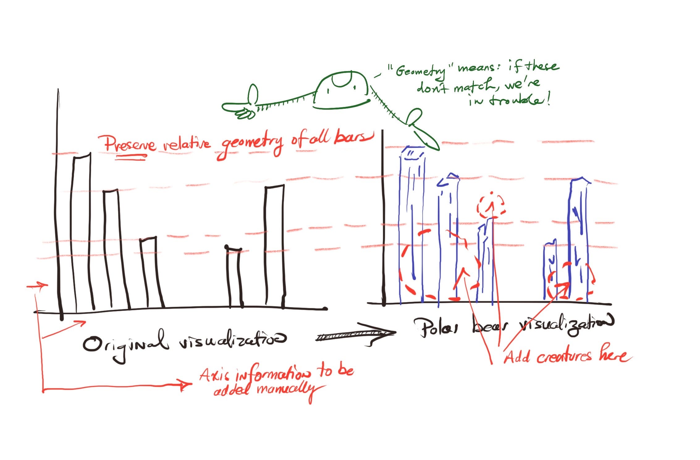
In my napkin, I emphasize geometry: anybody can reconstruct a chart using AI. The problem is that the relative geometry of the chart must be preserved. That means that if you stretch or squeeze the visualizations, the proportions and size of all the bars must remain (reasonably) identical.
Said differently, imagine if, after embellishing a bar chart with AI, two bars that used to be the same height are now completely different. You’d be lying with statistics!
Doing It With AI
Step 1: The Chart
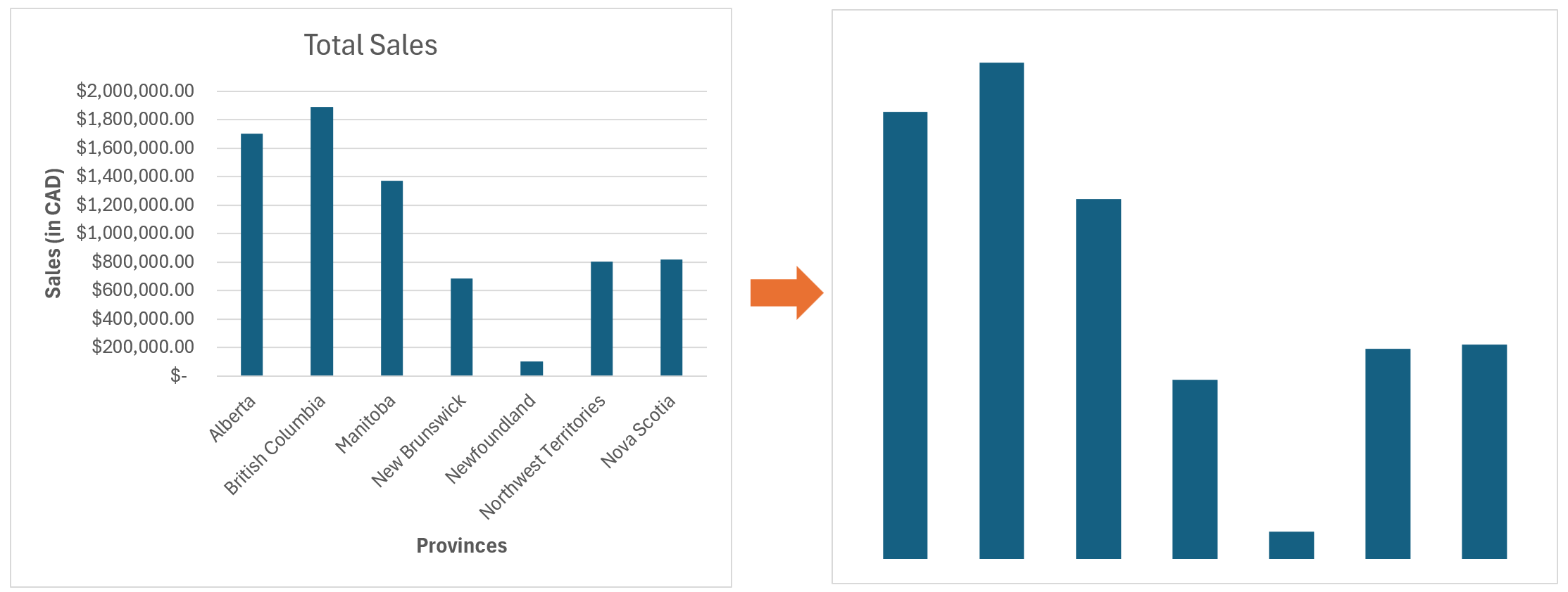
We begin with a bar chart – any will do. In this case, I used a sample from Tableau’s “Superstore” dataset, which contains performance data from several Canadian provinces. I constructed a bar chart in Excel based on a small, random sample from this data (as such, the patterns shown here might not represent Tableau’s full dataset).
Importantly, while image generative AI has made significant strides in accurately displaying text within images, the large amount of text and numbers usually displayed in a chart implies a high chance of the AI-generated text within the chart being erroneous. Moreover, we do not want elements other than the bars in our reimagined chart. Hence, the chart needs to be cleaned up as shown below, by simply selecting and deleting all unnecessary elements.
Step 1: Reimagining the Chart
Now, the bar chart must be reimagined using image generative AI. There are several potential approaches that might be used here, such as inpainting or using a ControlNet. In multiple failed experiments, I did not encounter much success with these approaches:
However, we can take advantage of a recent development in image generative AI: the availability of image editing models. Specifically, we will use the FLUX KONTEXT model to reimagine the chart, which is available on the NightCafe platform. We need:
The FLUX KONTEXT model (NightCafe offers three price variants: Dev, Pro, and Max)
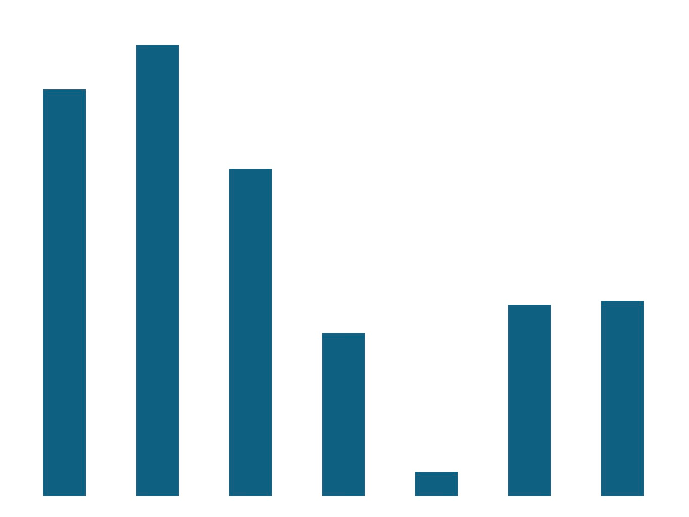
A start image (in this case, an image file of our cleaned chart – the higher the resolution, the better). If you’d like to replicate this exercise, download the image below.
A text prompt, describing the edits to be made. Crucially, the prompt should also describe what should not vary and thus be preserved. In this case, the text prompt I wrote reads:
Transform this chart into a photorealistic, dramatic style. The background should be a snowy daylit scene, without clashing with the rest of the image. Each bar should be a blue icicle. Preserve the chart’s exact structure, bar size, and location.
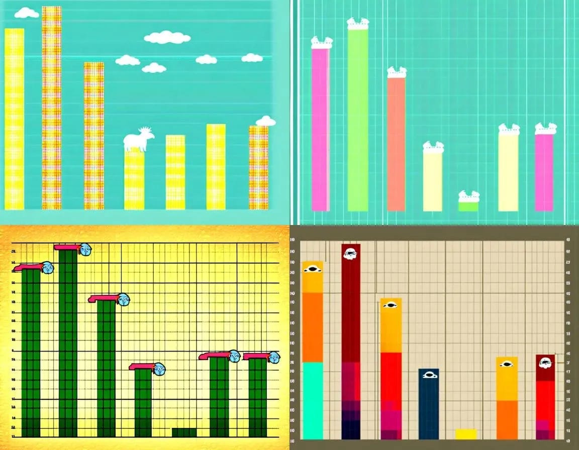
I generated two reimagined bar charts with each of the three FLUX KONTEXT models in NightCafe. While the cheaper model’s output is bright, vibrant, and whimsical, the more expensive models generated much darker output, highlighting that more expensive models need not always yield the best results.

Moving forward with KONTEXT Dev as the model of choice, I generated two additional images and then overlaid the original bar chart (now orange, with white transparent color, for visibility). Was our accuracy goal satisfied? Is the relative geometry of all bars preserved?
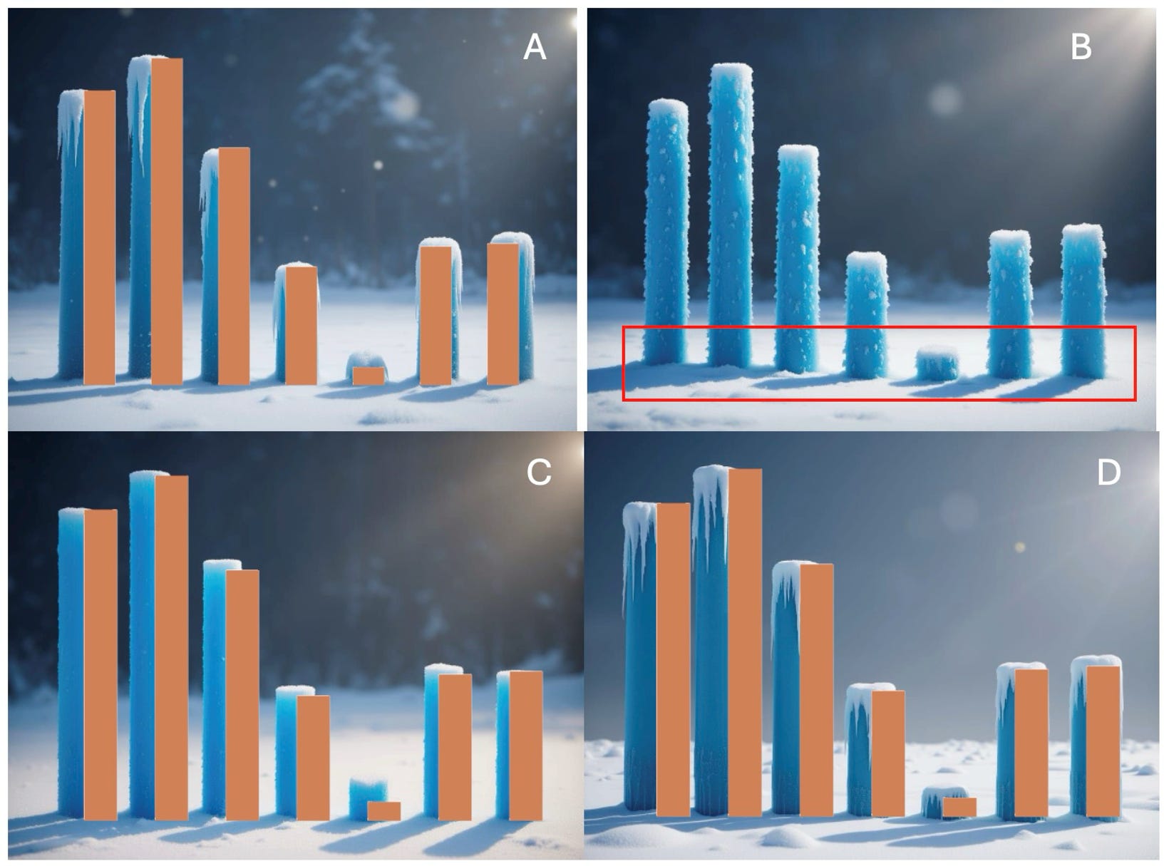
As can be seen, the answer is not straightforward.
While charts A, C, and D all preserve (for the most part) the location of the bars, those in chart B do not line up (some are closer to the foreground than others).
When considering the smaller bar, Chart C seems to almost double its size, whereas in A and D, this is much less of an issue.
Considering that our goal was to keep the bars reasonably identical, I chose to move forward with A, which seemed the most visually appealing of the remaining pair.
Step 3: Breathing Life
While our bar chart looks cooler (no pun intended), it looks sterile —an ordinary bar chart wearing the skin of a whimsical photo. To further breathe life into the visualization, the trick is that FLUX KONTEXT can be used iteratively: start with an initial editing prompt and image, then save the new image, request further edits through a new editing prompt and image, save, and keep going.
To do so, however, we need a preliminary step, in which we’ll add visual elements that will represent areas for the FLUX KONTEXT model to edit. In the napkin plan, I added three red dashed circles – that’s where we’ll further edit. This can be done in PowerPoint. I first saved an upscaled version of our Icicle Chart A (available through NightCafe, which uses the Real-ERSGAN x4+ upscaler), and then added three objects manually as follows:
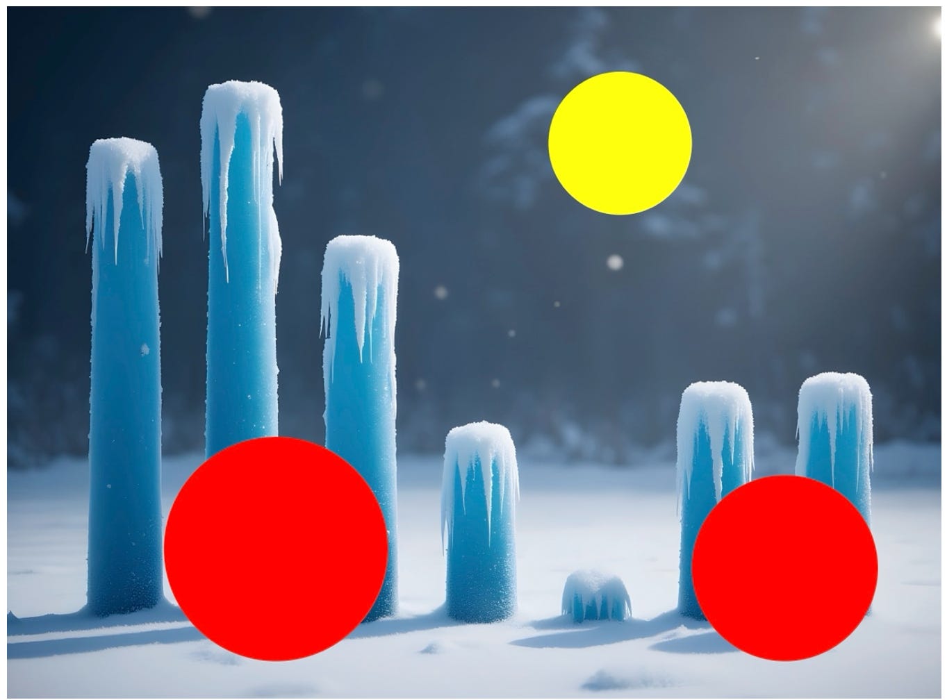
Here, the three colored spheres represent placeholders to be filled by FLUX KONTEXT. Going back to NightCafe, we can use this image as input, alongside a new editing prompt:
Replace the red dots with playful polar bears, and the yellow dot with a regal snowy owl in mid-flight. Preserve the picture’s exact structure, and the size and relative location of the vertical icicles.
Repeating this process two times, with each of the three FLUX KONTEXT models, yields the following results:

Interestingly, aesthetics aside, the cheaper Dev model didn’t correctly replace the yellow placeholder in one instance. What’s more, the bear cubs, though cute, oddly seem to have no necks and resemble a strange polar bear-corgi breed. The most expensive Max model seems to cut off the owl’s wing in the first try. The mid-range Pro model performs best, with good visual appeal, no strange proportions, and correct edits. But did any of these models satisfy our accuracy goal as well?

As in our first pass, the answer is a bit nuanced. By taking the original chart and resizing it to maintain its relative proportions, we can see that all of these examples are reasonably accurate to the naked eye. The stubborn exception remains the smaller bar, which, despite our efforts, is still a bit off. But it’s a reasonable attempt in my view – no “lying with statistics” here. Our bear chart is now almost complete!
Step 4: Final Touches
Having selected the leftmost FLUX KONTEXT Pro image, the final step is to add details, which can be done in any image editing software (for simplicity, I used PowerPoint). Adding x-axis labels and a title is straightforward:

(Yes, Canadian provinces have very long names.)
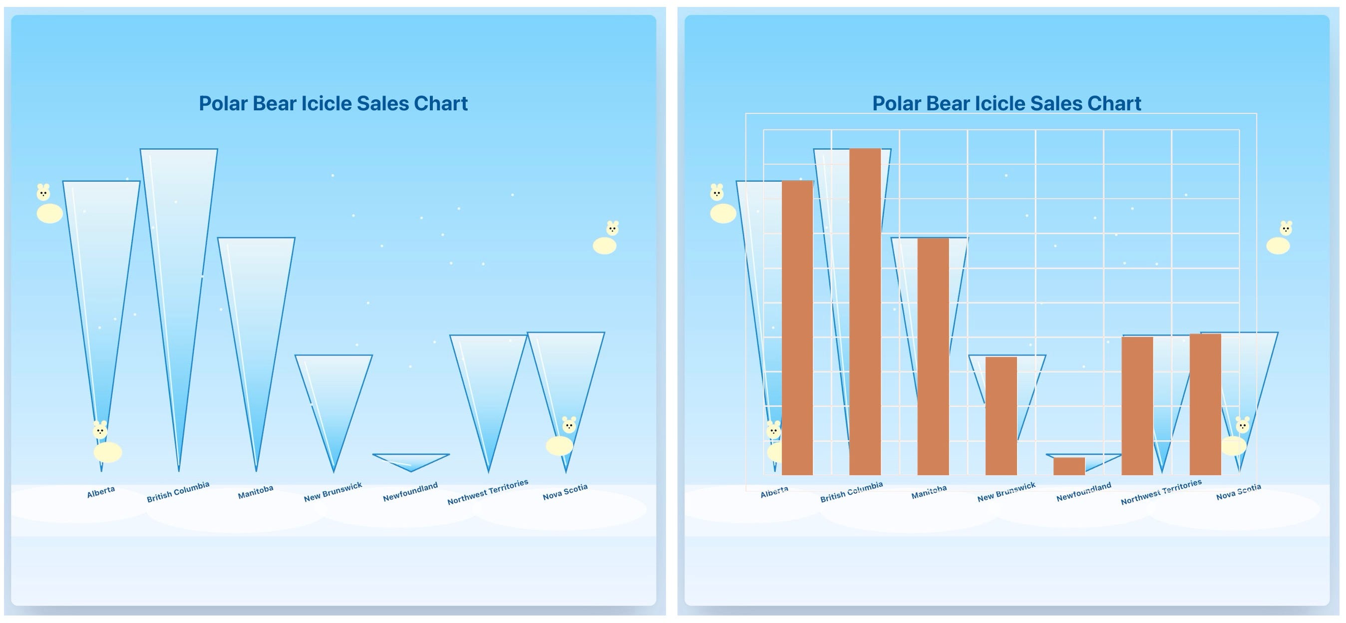
Adding the y-axis is a slightly more involved matter. We can again rely on the idea of overlaying the original chart on top of the reimagined one as follows, in order to add the y-axis ticks manually (it looks ugly, but that’s beside the point, since the goal is just to assess the bear chart’s geometry and edit the y-axis):

With an overlay of the original chart, we can see that the bars match very well, and the gridlines of the original chart can be used to form the new Y-axis:

Our bear chart is now complete! If you’re wondering if the chart is truly accurate, use the table below it to verify. With the exception of Newfoundland (the small bar, which is somewhat inaccurate despite our best attempts), the rest are very accurate.
Addendum: Claude’s Solution
The bear chart can also be constructed in Claude directly using two prompts, providing the original data table to first construct a simple bar chart, and then reimagining it:
(1) Take this data and construct a bar chart.
(2) Can you transform this chart into a whimsical image, with polar bears and the bars as icicles? The relative position, height, and width of all bars must be preserved.
After some tinkering (the chart originally didn’t display correctly), here’s Claude’s solution:
Is it ugly? Sure! Does it respect the initial chart’s original geometry? Sure! I respect that. But, still, I would opt for the FLUX KONTEXT, image generative AI approach. I think it strikes a much better balance between accuracy and visual appeal.
Did We Do It?
Today, we reimagined a bland bar chart into a more lively, whimsical bear chart with AI. We constructed it with affordable AI tools and edited it with MS Office. The reimagined chart is reasonably accurate, and simple edits to the one problematic bar (e.g., Photoshop) could be made to fix it. Alternatively, given the reasonably accurate output generated by FLUX KONTEXT Dev, a few more cheap variations might generate an even more accurate chart.
In my view, this is a satisfactory exercise for a number of reasons.
The bear chart is clearly more engaging and visually interesting – ideal for projects where vividness and audience engagement are a plus.
One would not create a set of these charts – instead, this might be a marquee visualization to highlight and explain a critical topic or insight. Considering this, the time required to construct it (about an hour or less) seems reasonable.
The slightly lower accuracy of the bear chart is acceptable in my view – especially if further simple edits can tighten the overlap between charts. We do not need to “lie with statistics” to generate interesting, whimsical charts with AI.
A few limitations and improvements to consider:
Tighten accuracy (see above).
Arguably, a polar bear-themed chart is not the most appropriate for a retail results chart – in practice, breathing life into a chart would involve more careful consideration of the context and intended audience.
Explore other charts (e.g., a line chart resembling a long children’s slide).
Understand that some charts with complicated colors and geometries (such as a radar chart) might not be good candidates for the approach discussed here.
I should have left more space for the axis, title, etc. – don’t forget that in your own applications!
Should you do this with AI?
If you don’t have the resources to hire a designer in-house, or you’re working on a personal project, sure.
However, while the bear chart is whimsical and visually interesting, it is not art. From the painstaking penciling of John Tukey’s charts, the scientific, yet poignant visual account of Napoleon’s fated 1812 march by Charles Minard, or the somber account of money in politics through Monopoly piece visuals by Wilson Andrews and colleagues at the NYT, the best visualizations are not those that merely feature appealing imagery: they all also possess a kernel of humanity, a je ne sais quoi that goes beyond mere data display.
We’re not getting that with this method – and I’m glad we don’t.
I rezonate with what you wrote. Data viz really needs imagination beyond just numbers. AI is key to bringing that life. Thank you!